While Google's release notes are usually short and not very descriptive when it comes to new features or changes, it is different this time around thanks to the anniversary.
The company published an article on the official Chrome blog, Chrome's turning 10, here's what's new, in which it highlighted some of the changes in the new version.
Chrome 69 is one of the few releases of the browser that makes modifications to the user interface.
First up, Chrome has a new look. You can see it across all platforms—desktop, Android, and iOS—where you’ll notice more rounded shapes, new icons and a new color palette.Tabs changed on the desktop to highlight website icons more.
We changed the shape of our tabs so that the website icons are easier to see, which makes it easier to navigate across lots of tabs.Chrome users who upgrade to Chrome 69 will notice the interface changes right away. The edges of tabs are rounded in Chrome 69, the profile icon was moved from the title bar to the main toolbar, and the height of the titlebar has been reduced even further in the new version.
Chrome 69: the new design

The screenshot that you see above depicts the new default design of the Google Chrome web browser on desktop operating systems. The screenshot was captured on a Windows 10 machine and the layout and design may look slightly different on other operating systems.
The screenshot below depicts the old design of the user interface.

It is possible, currently, to restore the old user interface in Chrome. The option to do so is powered by an experimental flag; these flags may be changed or removed at any time and it is unclear for how long Chrome users will have the option to restore the old UI layout.
Here is what you need to do:
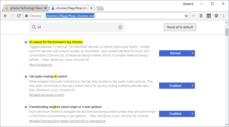
- Load chrome://flags/#top-chrome-md in the browser's address bar. The flag is still available if the experiment UI Layout for the browser's top chrome is returned as the first result on the page that is loaded.
- Activate the menu next to the flag and set it to Normal.
- Restart the Chrome browser.
Note: You can experiment with other UI layout options, e.g. touchable or hybrid to pick the one that works best for you. Just remember that these options may be removed by Google at any time.
- Normal - for clamshell devices
- Hybrid (previously touch) middle point for devices with a touch screen
- Auto, unclear, likely automatic selection.
- Touchable - new unified interface for touch and convertibles (Chrome OS)
- Material Design refresh
- Touchable Material Design refresh.
Source: https://www.ghacks.net/2018/09/05/how-to-restore-the-old-google-chrome-design/